The Importance of Bee-ing Infographics
Research, Information Design
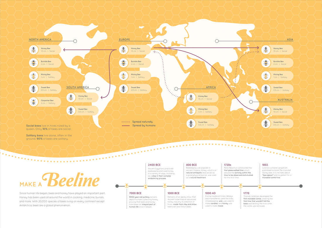
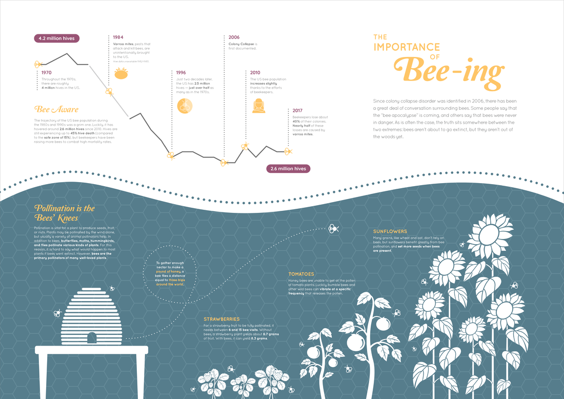
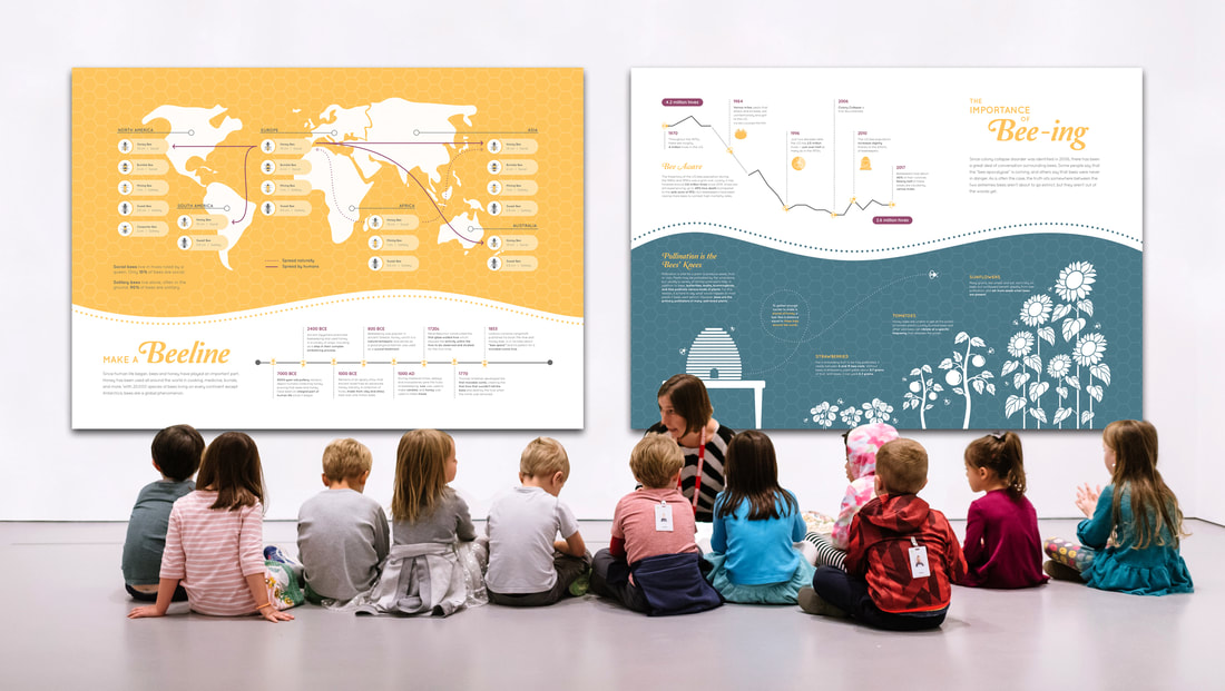
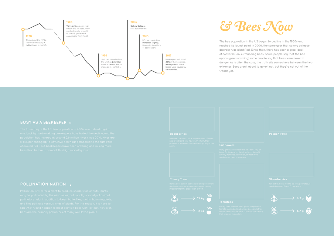
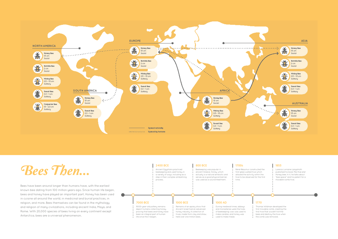
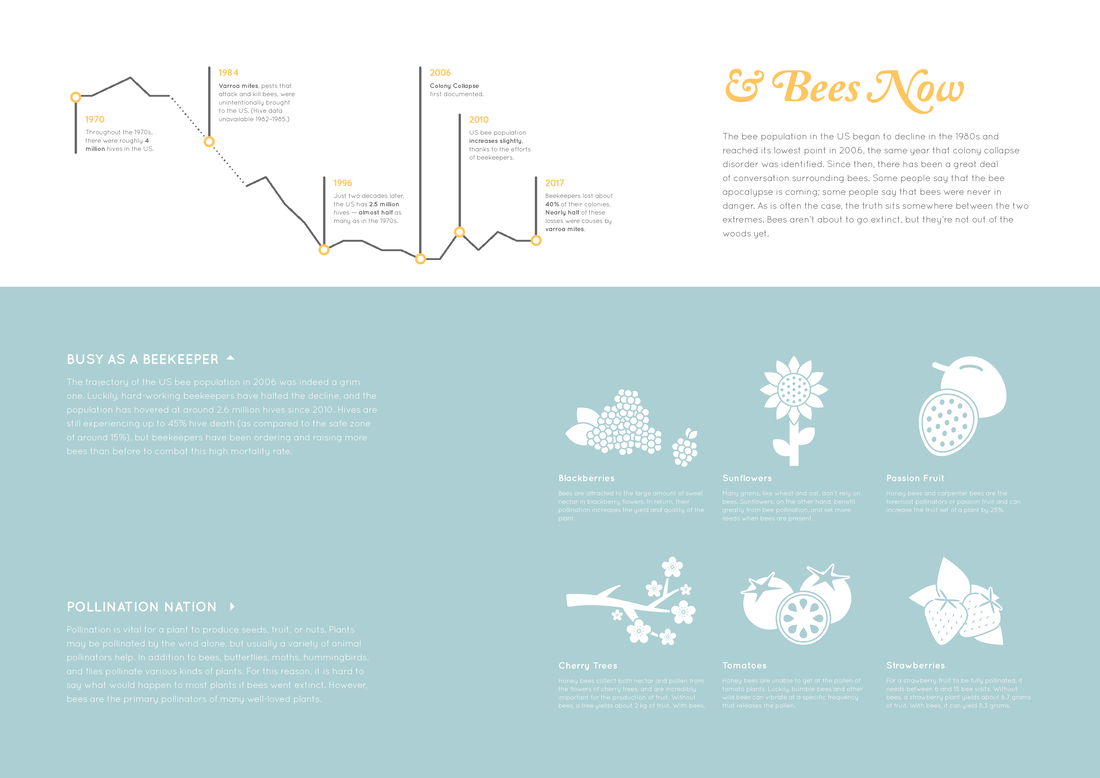
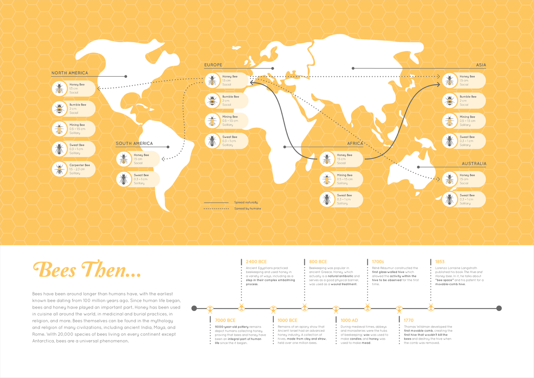
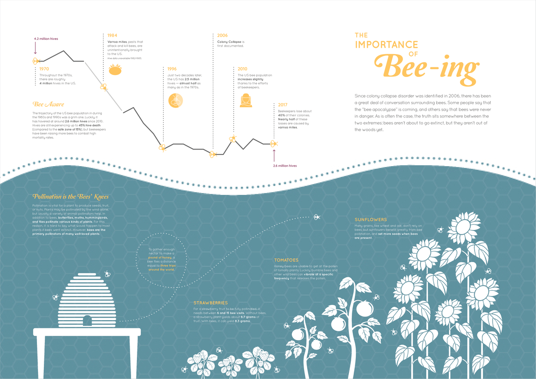
This project, which spanned the semester, required two panels — that could stand apart or together — to express a topic that was either sequential, evolutionary, or cyclical. I chose to research and articulate the topic of bees, specifically colony collapse disorder and its implications. There is a lot of misinformation on the internet and social media about colony collapse, and it was my goal to share correct and nuanced information.
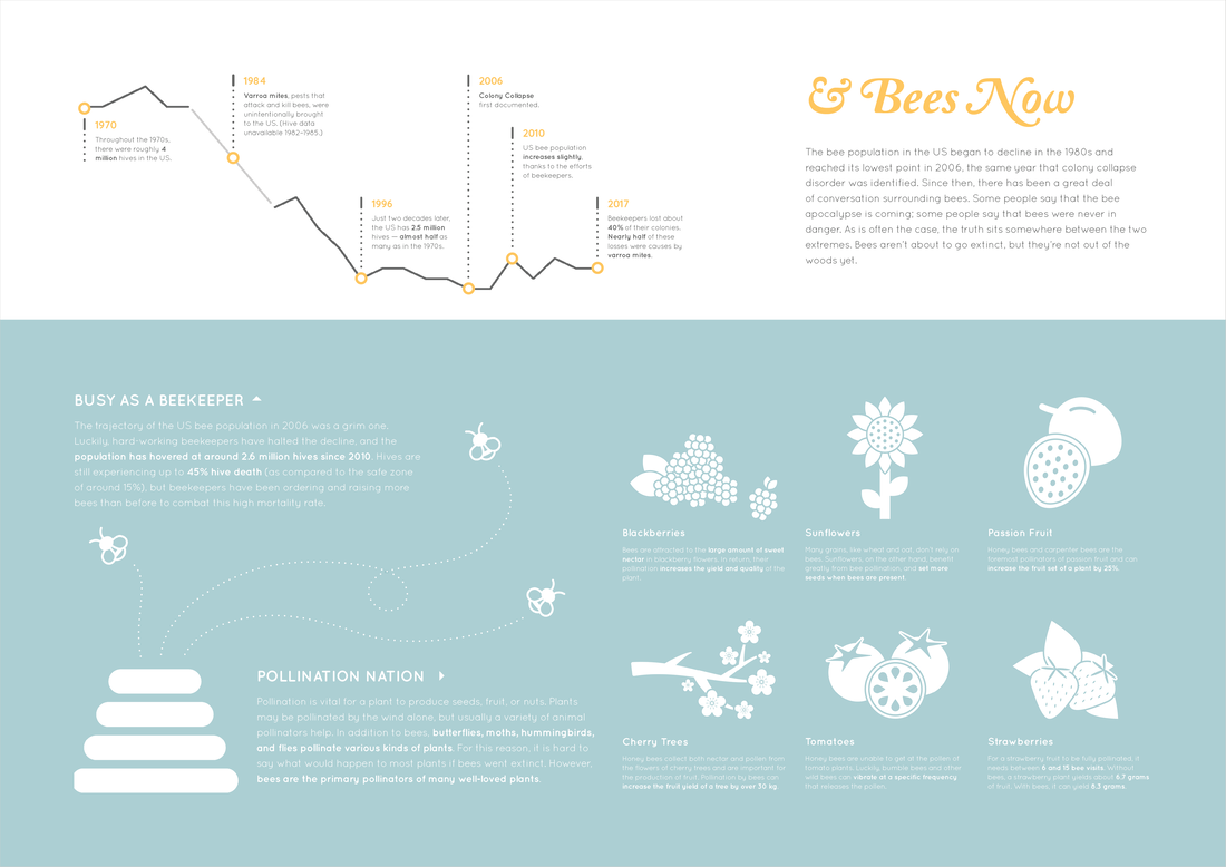
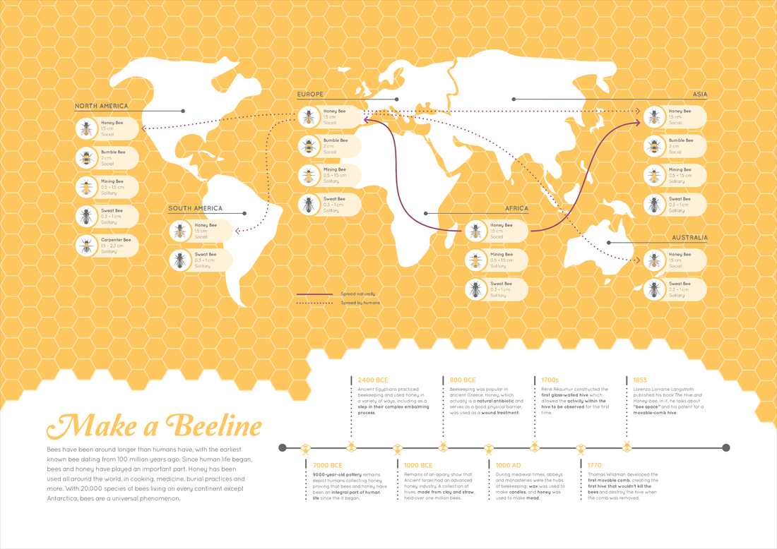
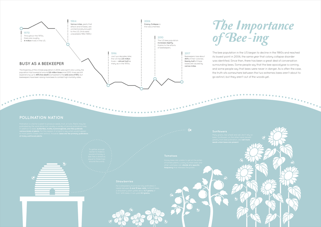
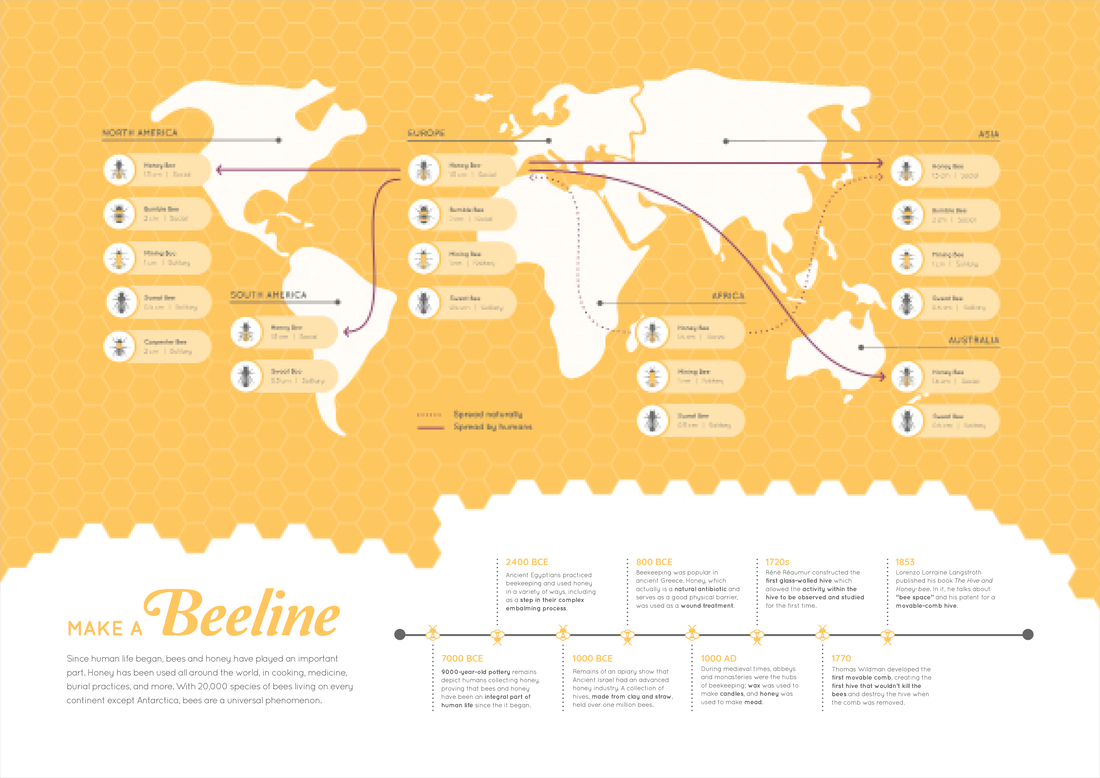
Throughout the semester, I developed my narrative, as well as my typography, graphics, colors, and overall visual language. My final panels tell the story of bees and their importance; one examines the early days of bees and their relationship with humans, and the second focuses on the decline in US bee populations and bees' role as pollinators.
Throughout the semester, I developed my narrative, as well as my typography, graphics, colors, and overall visual language. My final panels tell the story of bees and their importance; one examines the early days of bees and their relationship with humans, and the second focuses on the decline in US bee populations and bees' role as pollinators.
Click on an image to view in higher resolution.
Draft 1
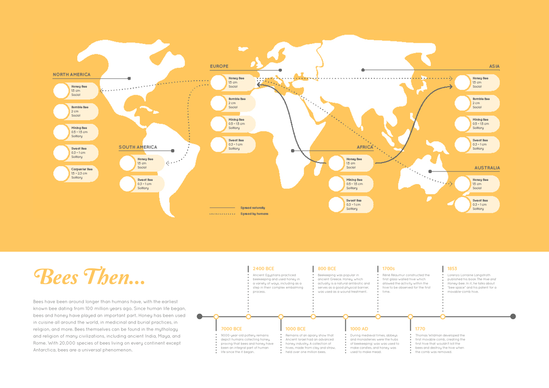
This first draft roughed out the content and placement of the text and visuals.
Draft 2
In the next version, the text remained the same, but I added the graphics.
Draft 3
This edit brought in more bee iconography. On the first panel, I added a honeycomb pattern behind the map and made the timeline markers into bees. On the second panel, I added a beehive graphic.
Draft 4
Next I broke out of the rectilinear format on both panels. I also changed the titles of each panel, and made significant changes to the graphics on the second panel.
Draft 5
In this draft, I adjusted typography across the board, added graphics to the timeline on the second panel, and darkened the blue of the second panel.
Draft 6
In this draft, which was the last before my final posters, I carried the curve line from the second panel into the first, incorporated a third color, and made refinements to typography and the map's visual language.
